Mapping the Past in the Present: Antioch Mosaics and ArcGIS Online
In light of the COVID-19 pandemic, ArcGIS has become a useful tool for tracking the spread of the virus across the world and mapping the number of confirmed cases in each country. Within our own community at Johns Hopkins University, researchers who work at the Center for Systems Science and Engineering (CSSE) have been using ArcGIS mapping software to create visualizations of COVID-19 in real time. Thus, it seems like now, more than ever, ArcGIS has gained a newfound importance in today’s society.

In my own personal research and workstream, ArcGIS has become an important tool as well. On Friday, my fellow student investigator Ella Gonzalez and I had a private consultation over Zoom with a member of the Data Services team at the Milton S. Eisenhower Library. She first suggested that we use ArcGIS Online instead of ArcGIS Pro for our project as it is less complex and more user friendly, and then went into a detailed presentation of the various tools we can use for visualizing the distribution of the Antioch mosaics. Compared to my first introduction to ArcGIS a few weeks ago, this presentation was tailored to my specific research interests and made me feel a lot more comfortable using the mapping software on my own time.
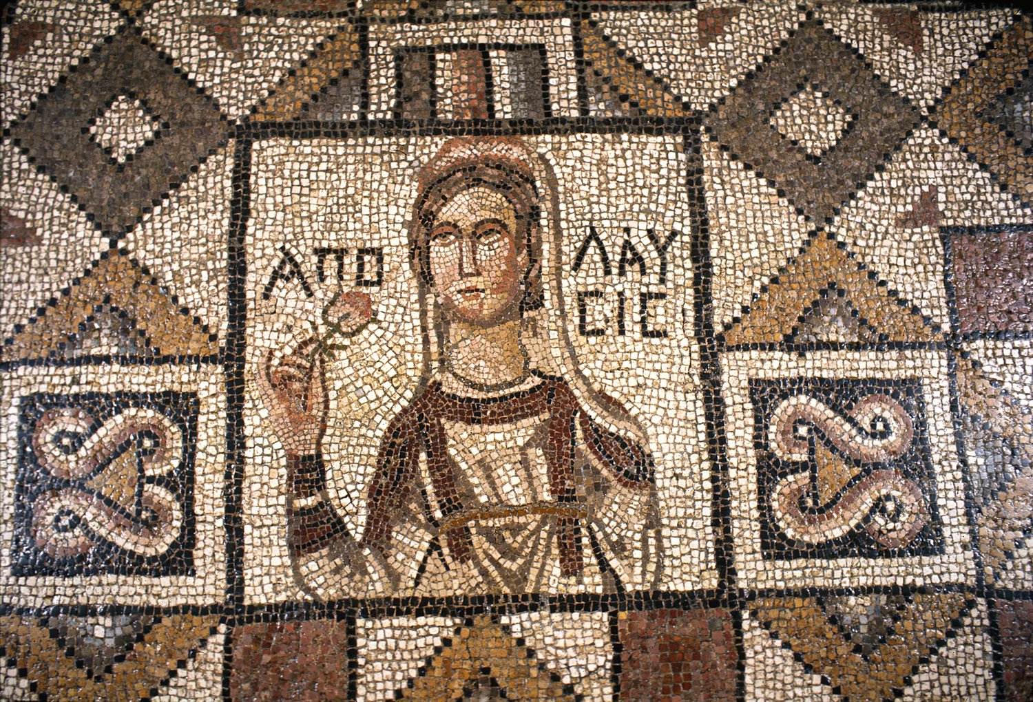
After our Zoom meeting, Ella and I decided on a three-phase plan for digitizing the distribution of the Antioch mosaics on ArcGIS Online: the first phase is inputting data into Google Sheets, the second phase is transferring this data to ArcGIS Online, and the third phase is adding external media (i.e., hyperlinks to museum collections, images of mosaics, and potentially the in situ locations of each mosaic).
In the first (and current) phase of our project, we are creating a detailed spreadsheet on Google Sheets that lists each museum in the United States, France, and Turkey that has an Antioch mosaic. Using Google Maps, we will then add the longitude and latitude coordinates of the museum into the spreadsheet, as this will be used within ArcGIS Online to physically map out the museum location. In the second phase of our project, we will be inputting the data from the spreadsheet into ArcGIS Online and adjusting the visual display of our location dots/map in general. In the third phase of our project, we will be adding external media (i.e., links to the museum website, images of the Antioch mosaics) to each location on our map. Depending on how long the first two phases take us, we may want to add links to three-dimensional renderings or floorplans of the houses from Antioch that once contained these mosaics. At the end of the third phase, I hope to publish our map through the University system. Thus, through using ArcGIS Online, I will not only be able to map the past in the present, but also create a graphic that can act as an educational resource for anyone interested in the distribution of the Antioch mosaics.
Maya Kahane